一覧に戻る
3. Use Commands - Type any command starting with
Real-World Example:
Storybook Assistant
skillAI駆動Storybook 9/10開発アシスタント。フレームワーク自動検出(React/Vue/Svelte/Angular等)。/setup-storybook、/generate-stories、/fix-accessibilityコマンド。Vitest + Playwrightテスト、axe-coreアクセシビリティ監査対応。
🎨 Storybook Assistant Plugin for Claude Code
Complete SOTA 2026 Storybook assistant with Vision AI design-to-code, natural language generation, AI-powered accessibility remediation, React Server Components, AI visual regression testing, design token sync, usage analytics, dark mode generation, and comprehensive testing (Storybook 10, React 19, Next.js 15).
🚀 First time here? Start with the ELI5 section for a quick overview, then check How to Use to get started, or ask "What can the Storybook Assistant do?" to see all available features!
✨ Features
🚀 Auto-Configured Storybook 10
- Automatic framework detection (React, Vue, Svelte, Angular, Next.js, Solid, Lit)
- SOTA 2026 best practices out-of-the-box
- Essential features (actions, backgrounds, controls, viewport) now built-in
- Vite-powered builds (48% smaller, 2-4x faster than Storybook 8)
- One command setup:
/setup-storybook
🧪 Modern Testing Stack
- Interaction Tests: Play functions with Vitest + Playwright (real browser testing)
- Accessibility Tests: WCAG compliance with axe-core (catches 57% of issues)
- Visual Regression: Pixel-perfect UI change detection
- Code Coverage: V8-powered coverage (faster than Istanbul)
🎨 AI-Powered Visual Generation (Optional)
- Style guides with color palettes, typography, spacing
- Component mockups to guide implementation
- Architecture diagrams for documentation
- Powered by Gemini 3 Pro Image / FLUX.2 Pro
- 100% optional - Works perfectly without OPENROUTER_API_KEY
🖥️ Multi-Platform Support
- Web (React/Vue/Svelte/Angular): ✅ Full support
- Tauri Applications: ✅ Full support with IPC mocking
- Electron Applications: ⚠️ Partial support (pure UI components, architectural guidance)
📦 Component Development
- Auto-generate stories for existing components
- Scaffold new components with stories, tests, and docs
- Intelligent variant detection (sizes, states, themes)
- Design system integration (MUI, Ant Design, shadcn/ui, Chakra, Mantine)
🚀 Quick Start
Prerequisites
- Node.js ≥ 20.0.0
- npm ≥ 10.0.0
- Claude Code CLI with
CLAUDE_CODE_OAUTH_TOKENorANTHROPIC_API_KEY - OpenRouter API Key (optional, for visual generation): Get key
Installation
Method 1: Via Claude Code CLI (Recommended)
claude

# In Claude prompt:
/plugin

# When prompted, enter:
flight505/storybook-assistant-plugin
Method 2: Manual Clone
# Clone to Claude plugins directory
git clone https://github.com/flight505/storybook-assistant-plugin.git ~/.claude/plugins/storybook-assistant

# Start Claude normally - plugin auto-loads
claude
Method 3: Project-Specific
# In your project directory
git clone https://github.com/flight505/storybook-assistant-plugin.git

# Start Claude with plugin
claude --plugin-dir ./storybook-assistant-plugin
Verify installation: Plugin will automatically check environment on SessionStart and display available features.
💡 How to Use After Installation
Once installed, the plugin is available in your Claude Code CLI sessions:
1. Start Claude Code in your project directory
cd your-project
claude
2. Discover Features
# Ask what the Storybook Assistant can do
"What can the Storybook Assistant do?"
"Show me Storybook plugin features"
"What Storybook commands are available?"
"Help with Storybook Assistant"
3. Use Commands - Type any command starting with /
# Initialize Storybook in your project
/setup-storybook

# Generate stories for existing components
/generate-stories

# Create new component with story and tests
/create-component
4. Or Use Natural Language
"Set up Storybook in this Next.js project"
"Generate stories for my Button component"
"Create a new Card component with dark mode support"
"Fix accessibility issues in LoginForm.tsx"
The plugin understands natural language and will automatically trigger the right skills!
📋 Quick Reference
Essential Commands
| Command | Description |
|---|---|
/setup-storybook | Initialize Storybook 10 in your project |
/generate-stories | Generate stories for existing components |
/create-component | Scaffold new component with stories |
/design-to-code | Transform design screenshots to React components |
/fix-accessibility | AI-powered WCAG 2.2 accessibility fixes |
/generate-dark-mode | Auto-generate dark mode color schemes |
/setup-visual-testing | Configure AI visual regression testing |
/sync-design-tokens | Sync design tokens between Figma and code |
/analyze-usage | Analyze component usage across codebase |
Example Workflow
# 1. Start Claude in your project
cd my-react-app
claude

# 2. See what's available
"What Storybook commands are available?"

# 3. Set up Storybook
/setup-storybook

# 4. Generate stories for components
/generate-stories

# 5. Or create something new
/create-component
# Then follow the interactive prompts!
🎓 ELI5: What Does This Plugin Do?
Imagine you're building a house (your app), and you need to organize all your building blocks (components) in one place where you can see them, test them, and make sure they work.
That's what Storybook does—it's like a workshop for your UI components.
The Problem
When building apps, developers create lots of UI pieces (buttons, cards, forms). It's hard to:
- See all components in one place
- Test them without running the whole app
- Check if they work on different screen sizes
- Make sure they're accessible for everyone
- Document how they should be used
What This Plugin Does
This plugin is your AI assistant that:
- Sets up the workshop - Installs Storybook 10 with all the right tools
- Organizes your components - Creates "stories" (examples) for each component
- Tests everything - Checks if buttons click, forms submit, colors contrast properly
- Guides you visually - Can generate mockups to show what components should look like
- Asks smart questions - Instead of typing commands, you click menu options
The Magic Part: No Typing Required
Before (traditional way):
npm install storybook
npx storybook init
# Answer 10 questions by typing
# Edit 5 config files manually
# Create example stories
# Install testing addons
# Configure webpack/vite
After (with this plugin):
claude
/setup-storybook
# Click your choices from menus
# Everything is done for you
The plugin detects your project automatically (React? Vue? Next.js?), asks what you want (testing? dark mode? visual mockups?), and sets everything up perfectly.
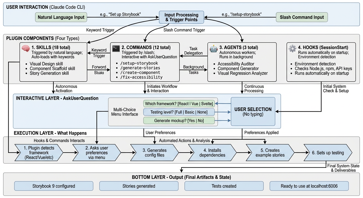
🏗️ How It Actually Works (Technical Architecture)
Architecture Overview
The Storybook Assistant plugin has 4 core component types that work together:
1. Skills (18 total) - Natural Language Triggers
What they are: Knowledge modules that activate when you use specific keywords in conversation.
How they work:
- You say: "Help me set up visual regression testing"
- Plugin detects keywords: "visual regression"
- Loads the
visual-regression-testingskill - Provides specialized knowledge and guidance
Examples:
visual-design- Activates on: "generate mockup", "style guide", "design system"component-scaffold- Activates on: "create component", "new component"accessibility-remediation- Activates on: "fix accessibility", "a11y issues"
Think of skills as: Auto-loading expert consultants who appear when their expertise is needed.
2. Commands (12 total) - Explicit Actions
What they are: Slash commands (/command-name) that perform specific tasks.
How they work:
- You type:
/setup-storybook - Plugin executes the command script
- Uses
AskUserQuestionto create interactive menus - Performs the action with your choices
Examples:
/setup-storybook      # Initialize Storybook
/generate-stories     # Generate stories for components
/create-component     # Scaffold new component
/fix-accessibility    # Run accessibility audits
Think of commands as: Direct action buttons with interactive wizards.
3. Agents (3 total) - Autonomous Workers
What they are: Specialized AI agents that work autonomously on complex tasks.
How they work:
- Triggered automatically or manually
- Have their own system prompts and tool access
- Work in the background while you continue
- Report results when complete
Examples:
accessibility-auditor- Scans codebase, finds a11y issues, generates fixescomponent-generator- Analyzes designs, generates React componentsvisual-regression-analyzer- Compares screenshots, detects UI changes
Think of agents as: Automated specialists who handle complex multi-step tasks.
4. Hooks (SessionStart) - Automatic Setup
What they are: Scripts that run automatically on specific events.
How they work:
- Runs when Claude Code starts in your project
- Checks environment (Node.js version, npm, API keys)
- Displays what features are available
- No user action required
Example output:
✅ Environment Check:
  ✓ Node.js v25.3.0 (>= 20.0.0)
  ✓ pnpm 10.28.0
  ✓ CLAUDE_CODE_OAUTH_TOKEN found
  ⚠ OPENROUTER_API_KEY not found (visual generation disabled)
Think of hooks as: Pre-flight checks that run before takeoff.
🎯 The Interactive Menu System (AskUserQuestion)
What It Is
Instead of making you type answers or edit config files, the plugin creates interactive menus where you click your choices.
How It Works
Behind the scenes:
// Plugin code (simplified)
AskUserQuestion({
  questions: [{
    question: "Which framework detected?",
    header: "Framework",
    options: [
      { label: "React 19", description: "Modern React with hooks" },
      { label: "Vue 3", description: "Composition API" },
      { label: "Svelte 5", description: "With Runes" }
    ]
  }]
})
What you see:
? Which framework detected? (Framework)
  ❯ React 19 - Modern React with hooks
    Vue 3 - Composition API
    Svelte 5 - With Runes
Real-World Example: /setup-storybook
The Flow:
-
Framework Detection (automatic)
- Plugin scans
package.json - Detects: "React 19 with Next.js 15"
- Plugin scans
-
Platform Detection (automatic)
- Checks for
tauri.conf.jsonorelectron-builder.yml - Detects: "Tauri application"
- Checks for
-
Design System Detection (automatic)
- Scans dependencies for MUI, Ant Design, shadcn/ui
- Detects: "shadcn/ui"
-
User Preferences (interactive menu)
? What testing features do you want? ❯ Full Testing (Recommended) - Interaction + A11y + Coverage Basic Testing - Interaction tests only No Testing - Stories only ? Enable visual generation features? ❯ Yes - Generate style guides and mockups (requires API key) No - Skip visual generation -
Execution (automatic)
- Installs Storybook 10 + selected addons
- Generates config files with your choices
- Creates platform-specific mocks (Tauri IPC mocks)
- Creates example stories
- Sets up testing framework
-
Result
✅ Storybook 10 Setup Complete!

Configured for: React 19 (Next.js 15, Tauri)
Design System: shadcn/ui
Testing: Full (Vitest + Playwright + axe-core)

Next: npm run storybook
Why This Matters
Traditional approach (other tools):
- Read 20 pages of documentation
- Answer questions by typing exact strings
- Edit 5 config files manually
- Install dependencies one by one
- Debug when something breaks
This plugin:
- Automatic detection
- Click your preferences
- Everything configured correctly
- Just works™
📚 Commands
/setup-storybook
Initialize Storybook 10 with automatic framework detection and SOTA configuration.
What it does:
- Detects your framework (React, Vue, Svelte, etc.)
- Detects platform (Web, Tauri, Electron)
- Detects design system (MUI, Ant Design, shadcn/ui, etc.)
- Asks for your preferences (testing features, visual generation)
- Installs Storybook 10 + addons
- Generates configuration files
- Creates example stories
- Sets up platform-specific mocks (Tauri/Electron)
Example:
/setup-storybook

# Output:
✅ Storybook 10 Setup Complete!

Configured for: React 18.2.0 (Vite)
Platform: Tauri
Design System: shadcn/ui

Features Enabled:
✓ Interaction Tests (Vitest + Playwright)
✓ Accessibility Tests (axe-core)
✓ Code Coverage (V8)
✓ Visual Generation (Style guide & mockups)

Next Steps:
1. Run: npm run storybook
2. Open: http://localhost:6006
/generate-stories
Generate story files for existing components with tests and variants.
What it does:
- Scans project for components
- Parses component props/types
- Detects variants (size, state, theme)
- Asks which components to generate stories for
- Generates CSF 3.0 stories with:
- Multiple variants
- Interaction tests (play functions)
- Accessibility tests
- Args/controls
- Optionally generates visual mockups for complex components
Example:
/generate-stories

# Interactive selection:
? I found 32 components. Which should I generate stories for?
  ☑ Button (src/components/Button.tsx) • 5 props • Button • 3 variants detected
  ☑ Card (src/components/Card.tsx) • 8 props • Layout • 2 variants detected
  ☑ DataTable (src/components/DataTable.tsx) • 12 props • Data Display • 4 variants detected

? What level of testing should I include?
  ● Full Testing (Recommended)

✅ Generated Stories: 3 components
  ✓ Button - 7 stories (3 variants + 2 interaction tests + 2 a11y tests)
  ✓ Card - 4 stories (2 variants + 1 interaction test + 1 a11y test)
  ✓ DataTable - 8 stories (4 variants + 2 interaction tests + 2 a11y tests)
/create-component
Scaffold a new component with story, tests, and documentation.
What it does:
- Asks what type of component (Button, Card, Form Input, etc.)
- Optionally generates visual mockup using AI
- Scaffolds:
- Component file with TypeScript types
- Story file with variants and tests
- Test file for unit tests
- Documentation stub
- Follows SOTA patterns and best practices
Example:
/create-component

? What type of component are you creating?
  ● Card/Layout component

? Component name?
  ProfileCard

? Generate visual mockup using AI?
  ● Yes (Recommended)

🎨 Generating mockup...
✅ Mockup saved: mockups/ProfileCard.png

✅ Component Created:
  - src/components/ProfileCard/ProfileCard.tsx
  - src/components/ProfileCard/ProfileCard.stories.tsx
  - src/components/ProfileCard/ProfileCard.test.tsx
  - mockups/ProfileCard.png

Next: Implement component following the mockup
/migrate-storybook
Migrate from older Storybook versions to Storybook 10.
What it does:
- Detects current Storybook version
- Analyzes configuration
- Lists breaking changes
- Performs migration:
- Updates dependencies
- Migrates configuration files
- Updates story format (CSF 2 → CSF 3)
- Installs new addons
- Runs
storybook automigrate
🏗️ Platform Support
✅ Web Projects (Full Support)
Supported Frameworks:
- React 18+ (TypeScript/JavaScript)
- Vue 3+ (Composition API)
- Svelte 5+ (with Runes)
- Angular 18+
- Next.js 14+ (with Vite)
- Solid.js
- Lit 3, Web Components
All Features Work:
- Complete Storybook setup
- Story generation
- Interaction tests
- Accessibility tests
- Visual generation
- Coverage reports
✅ Tauri Applications (Full Support)
Why It Works:
- Tauri is frontend-agnostic (any web framework)
- Storybook runs independently from Tauri runtime (different ports)
- No IPC conflicts
Development Workflow:
Terminal 1: npm run tauri dev     # Port 5173 - Tauri app
Terminal 2: npm run storybook     # Port 6006 - Component development
Terminal 3: npm run test:watch    # Vitest watch mode
IPC Mocking: Plugin automatically generates Tauri IPC mocks:
// Auto-generated: .storybook/tauri-mocks.ts
export const tauriMocks = {
  invoke: async (cmd: string, args?: any) => { /* mock */ },
  listen: (event: string, handler: Function) => { /* mock */ },
};
Best Practice:
- Keep UI components Tauri-agnostic
- Use dependency injection for IPC calls
- Test IPC integration separately with E2E tests
⚠️ Electron Applications (Partial Support)
What Works:
- Pure UI components (presentational)
- Components without direct Electron imports
- Design system components
What Doesn't Work:
- Components with direct
electronmodule imports - IPC integration testing (requires E2E tests)
- Main process code
Plugin Provides:
- Custom webpack configuration for Storybook
- Electron preload API mocks
- Architectural guidance for decoupling UI from IPC
- Container/presentational pattern examples
Recommended Pattern:
// ✅ Pure component - works in Storybook
function DataDisplay({ data, onRefresh }) {
  return <div onClick={onRefresh}>{data}</div>;
}

// ❌ Electron-aware container - doesn't work in Storybook
function DataDisplayContainer() {
  const [data, setData] = useState(null);
  const handleRefresh = async () => {
    const result = await window.api.fetchData(); // Electron IPC
    setData(result);
  };
  return <DataDisplay data={data} onRefresh={handleRefresh} />;
}

// Storybook story - test pure component
export const Default = () => (
  <DataDisplay data="Test Data" onRefresh={() => {}} />
);
🎨 Visual Generation (Optional)
Setup
# 1. Get API key
# Visit: https://openrouter.ai/keys

# 2. Add to .env
echo "OPENROUTER_API_KEY=your_key_here" >> .env

# 3. Restart Claude Code
Features
Style Guides:
- Color palettes with hex codes
- Typography scales
- Spacing systems
- Component examples
Component Mockups:
- Visual references for complex components
- Multiple style variations
- Responsive design mockups
Architecture Diagrams:
- Component dependency trees
- Data flow visualizations
- System architecture
Cost
- Typical cost: $0.05-0.15 per image
- Generated selectively (complex components only)
- User control over what to generate
Graceful Degradation
Without OPENROUTER_API_KEY:
- ✅ Storybook setup works
- ✅ Story generation works
- ✅ Testing works
- ❌ Visual generation skipped (informs user once)
- 📝 Provides text-based templates instead
🧪 Testing
Interaction Tests (Play Functions)
export const WithInteraction: Story = {
  play: async ({ canvasElement }) => {
    const canvas = within(canvasElement);
    const button = canvas.getByRole('button');

    await userEvent.click(button);
    await expect(button).toBeInTheDocument();
  },
};
Powered by:
- Vitest (fast test runner)
- Playwright (real browser automation)
- Testing Library (user-centric queries)
Accessibility Tests
export const AccessibilityTest: Story = {
  parameters: {
    a11y: {
      config: {
        rules: [
          { id: 'color-contrast', enabled: true },
          { id: 'button-name', enabled: true },
        ],
      },
    },
  },
};
Powered by:
- axe-core (industry standard)
- WCAG 2.1 compliance
- Catches 57% of issues automatically
Code Coverage
# Run tests with coverage
npm run storybook:coverage

# View report
open coverage/index.html
Powered by:
- V8 coverage (faster than Istanbul)
- Coverage watermarks
- Per-story coverage tracking
🛠️ Configuration
API Keys Priority
The plugin checks for API keys in this order:
For Claude API:
CLAUDE_CODE_OAUTH_TOKEN(preferred)ANTHROPIC_API_KEY(fallback)
For Visual Generation:
OPENROUTER_API_KEY(optional)
Environment Variables
# Required (one of):
CLAUDE_CODE_OAUTH_TOKEN=your_token_here
# OR
ANTHROPIC_API_KEY=your_key_here

# Optional (for visual generation):
OPENROUTER_API_KEY=your_key_here
.env File
# Create .env in project root
CLAUDE_CODE_OAUTH_TOKEN=your_token_here
OPENROUTER_API_KEY=your_key_here  # Optional
📖 Documentation
🤝 Contributing
Contributions welcome! Please read CONTRIBUTING.md for guidelines.
📄 License
MIT License - see LICENSE for details.
🙏 Acknowledgments
- Storybook Team - Amazing component development platform
- Vitest - Fast, modern test runner
- Playwright - Reliable browser automation
- OpenRouter - AI model access
- Claude Code - AI-powered development environment
- Gemini 3 Pro Image - Architecture diagram generation (via NanoBanana plugin)
📞 Support
- Issues: GitHub Issues
- Discussions: GitHub Discussions
- Twitter: @flight505
Built with ❤️ by Jesper Vang
Powered by State-of-the-Art 2026 best practices 🚀